Monday, 28 November 2016

Portraiture Definition

Portraiture is the photography or art of taking a picture of ones face where their facial expression is shown.

I have chosen this image to represent portraiture since the persons facial expression is shown and easily identifiable.

This portrait meets our expectations of a political or war hero since the masculine lighting of this portraiture demonstrates powerful body language and facial expressions. His clothing also indicates a formal position of work, in this case being a politician. 


This photograph taken by Amanda Lepore has feminine lighting which demonstrates the comfort of the person in the photograph. The personality indicated could be narcissistic or a sassiness from the overuse of makeup.


Shape Work Diary


This photograph was taken with a slower shutter speed with a higher aperture to bring out the light reflection and shape of the fountain. This is well composed since the path way behind the shape of the fountain the in a straight line.


This photo was taken with a very high aperture of f 22 which is why everything is in focus including the shape of the object and the background involved. I also think that this well well composed since the line of the beach in the background is a straight line. This photo has an easily recognisable focus point being the object in the middle.

This photo does include the shapes of the water flowing and the leafs from the water also. This was taken with a longer shutter speed to capture the dark scenery included in the photograph. I do not like this photograph since the settings were not very well accustomed to the dark background. This then caused the final capture of the photograph to come out grainy and out of focus. This would have been improved if the camera settings were adjusted to a more suitable setting which would then bring out a sharper image which would be more pleasant for the viewers eye. 

Framing Work Diary


.


This photo was taken by using a tripod placed onto the grass of a field. The aim of this photograph was to use the golden rule by offsetting the tree to the right. The camera settings were set to a high aperture with an f stop of 22. Before shooting this photo the camera was composed to match to the line of the top of the grass, focused onto the tree then took the photograph.


This photo was not taken with a tripod and also had the same camera settings as the photograph above. I do not like this photo since it does not match up to any sort of framing weather it is the rule of thirds or the golden rule. This photo would have been much better if it was taken with a camera position more to the right since it would have brought about the showing of the rule of thirds from the scaffolding of the building.


This photo was also taken without a tripod and with the same camera settings. This photo is well composed since the rule of thirds was used on the left side of the photograph. I also like the fact that the high aperture brings out the rest of the photograph of its surroundings.

Shape Straight Images


I like this picture representing shape since this machinery is in an unusual place to me being at the beach. I do also like the wide depth of field used since it demonstrates the shape of the object as well as its surroundings.

I also like this picture since it shows the shape water can take place and how it could change and flow as shown from the longer shutter speed used on the camera. This appeals to me since the fountains are also in an unusual spot making me want to know this destination.


This picture interests me since the macro shot really brings the water into viewpoint with its narrow depth of field. Also, this picture interests me since it is interesting to see what shape water can take in the conditions that it has.


This picture also interests me since it displays all sorts of shapes being reflected  onto the water. For example the wooden construction in the middle has a near to perfect reflection onto the water, making it interesting for me to view.


Finally this photo also interests me since the water has taken a very elegant shape from the fountain. The well composed shot of the photo easily influences the viewer to focus onto the fountain.

Sunday, 27 November 2016

Quiz

The main f stops are: 2, 2.8, 4, 5.6, 8, 11, 16, 22, 32, 64

The recommended f stops are f22 and up

Because it gives a wide depth of field

If the f stop was changed from 8 - 11 the light would be darker since the higher f stop, the less light that enters the camera by half.

The photographers that we were introduced to were Ansel Adams and Simon Roberts

Joiners Work Diary

The way that I have created these joiners was by choosing a location of an object or person and take several photographs of the object in sections. This was done such as the sculpture below.(not all images)


After the pictures were taken, They were resized to a width of 6 cm in width and 4 cm in height with a resolution of 300. After that they were all pasted onto a separate A4 image and rearranged to create the joiner. (below)

Framing Straight Images


This photo represents the rule of thirds being used and appeals to me since the depth of field shows the full image from the bark of the tree to the grass plains and the other trees in the background.


Similar to the photograph above, this photo also used the rule of thirds from the off-setted tree on the right and left side. This appeals to me since it demonstrates the beauty of nature, even if it is as simple as a field.


This photos colours and patterns interest me because those colours all have a meaning since this is a building site. The rule of thirds was used to frame the image and has myself the viewer think that industrialization is gradually taking over the nature of the planet.


I like this photograph since it uses the left third to frame the photograph and demonstrates a perspective of where this location is. The wide depth of field also brings out the full view of the photograph, having me as the viewer question what could be further into this location.


This photo demonstrates the golden rule since it offsets the tree slightly to the right and brings about the focus of the person under the tree. This also looks interesting to me because of the silhouette look on the tree. This photograph also has me question what the person in the photograph could be looking onto over the hills.

Framing Contact Sheet

Wednesday, 23 November 2016

Tone Work Diary


This photo was taken using my macro lens with a narrow depth of field and a low ISO sensitivity. This pictures focus point for the viewer is easy to identify.


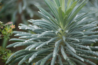
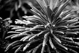
This photo in my opinion in my best. There is a narrow depth of field and a low ISO sensitivity. This was also taken with my macro lens and demonstrates the tones of the leafs, water and flowers around it.


This was taken with a higher depth of field to show the landscape around. The shutter speed was fast and the ISO sensitivity was also low.


In my opinion, all of these photos show almost all the tones in Ansel Adams tone system from 1 to 10. These were all edited to back and white and tones were enhanced by a changing the curve values on Photoshop. The two pictures below demonstrate how the picture was edited before and after.

Before
After

Texture Straight Images


I think that this picture represents texture well since the wood streaks in that formation appeals to me as the viewer. It also bring a warm feeling because of the orange colours involved in the photo.


This also appeals to me since this photo has me question what surface or materiel this is. It also bring about a warm feeling since the orange lighting reflected off of the white surface.


I think this is a good photo since it has a direct view of the subject being the roast potatoes in the shot. It also brings a warm feeling to the photo because of the yellow and orange colour of the potatoes.


I like this photo since it clearly shows how sand can be in many forms and has me imagine how it would be like walking on this sand.


This photo appeals to me since it also has me imagine how it would be like to play with the sand as if I was younger once again. The various tones also help demonstrate how the sand can be constructed in different forms such as hills or flat surfaces.

Tone Straight Images


This photo is a good representation of  tone since it includes many of the tones from Ansel Adams tone system. This photo also contains an interesting foreground and background. It also has the viewer question where this photo could have been taken.


This photo also represents tone since it demonstrates the various tones sand can make. This is appealing to me since the hill shows a clear representation  of these tones.


This is one of my favorite photos from tone since it contains a wide variety of tone and the focus point is easy to identify. This also appeals to me since it clearly shows the various forms of the leafs.


This is also one of my favorite photos because it shows all tones from Ansel Adams tone system from 1 to 10. It also shows the freeze frame of the water droplets on the interesting shape of the plant.


I like this photo because the foreground, midground and background are easily identifiable and has the viewer question where this location could be.

Tone Contact Sheet


Framing Image Bank


I have chosen these pictures to be apart of my image bank for framing since all photos demonstrate a frame inside of a frame. For example, the top photo shows the foreground and background being framed together.

Movement Image Bank


I have chosen these images to be apart of my movement image bank since the shutter speed has been slowed to show the movement of different objects such as the dice above when it is thrown. It takes that path that the shutter speed blur has left behind.