Topic
My chosen topic for this photo documentary is to record the way that the urban world harmonies with earths nature. This will be recorded by taking landscape photographs of both the urban environment as well as the naturalistic areas that can be found in Harlow town.
Shoot One Documentary
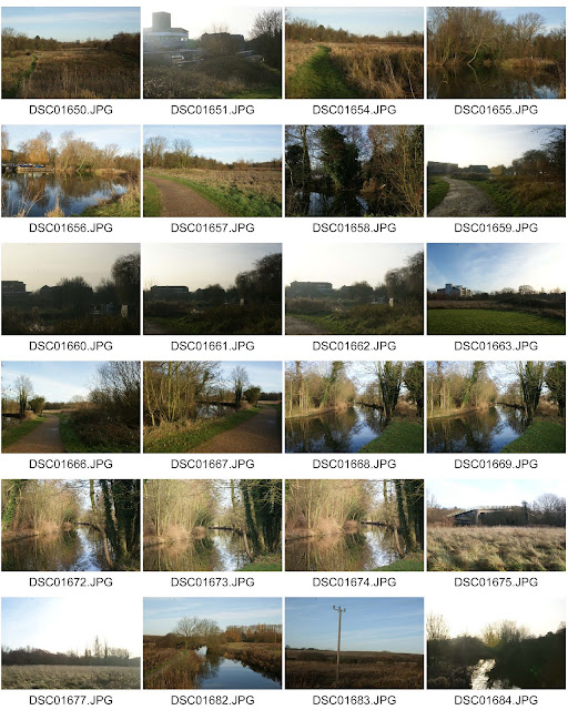
This first occasion of taking photographs was to discover the nature that can be found in Harlow town which relates to how the urban world harmonies with the earths nature. The location of these photos was the River Stort, towards the Harlow train station.
Contact Sheet:
Straight Images:
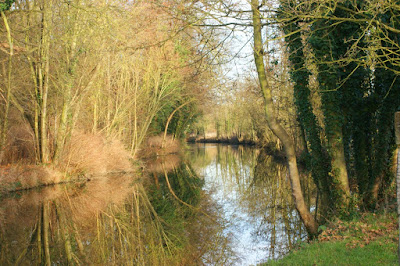
This is my favorite photograph when taking photographs on the first occasion. The reflection from the lake gives an aesthetic appearance to the viewer as well as the rule of thirds also used on the right and left side from the tree trunks reflecting off the water. The focus point of the photograph being the lakes reflection and beyond down the lake also gives an aesthetic appearance.
This photo is also similar to my first photograph since it shows the reflection of the trees and the elements of line and reflection are involved in the photo. This photograph was inspired by Simon Roberts style of photography in regards to landscape photographs being taken on elevated areas. This was taken on the bridge above the lake to give this elevation.
This photograph demonstrates the harmonization of the urban world and the naturalistic environment. This in particular shows the overgrowth of greenery on the walkway, showing how plants can take over such man built objects. The shape of the walkway also interests me since its an unusual shape in my opinion. This photograph was also inspired by Simon Roberts since some of his photographs include man made buildings as naturalistic landscapes.
I like this photograph since it demonstrates the way that human made pathways have such a relation with nature such as the complementary colours between the grass and gavel pathway. The pathway also gives the photo a good focus point to have the focus travel down the pathway then the surrounding trees around the photograph. This focus was achieved with the lines of the gravel used in the photograph.
This is my final photo for my straight images. This photo was again influenced by Simon Roberts since it both shows little man made buildings as well as the photograph being taken on an elevation.
I like this photo since the overcasting shadows really bring out various tones to the photo, almost fading the left side from darkness into the lighter left side of the photograph. The foreground, midground and background also give the photograph a lifelike feeling of what it would have been like at this destination at that time.
Work Diary Photo 1:
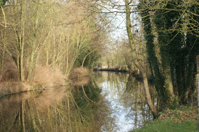
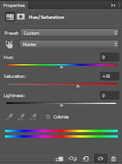
This photograph was taken using a tripod to compose the photo and make sure that there was no motion blur while the photograph was taken. The aperture used was an F stop of 22 to bring out every detail in this landscape including the reflection from the lake. I think that this photograph does not need to be rotated or cropped in any way since it demonstrates the rule of thirds easily and shows the reflection very clearly. Editing could be to enhance the colours by increasing the saturation of the photograph.
 |
| Before Edit |
 |
| After Edit |
 |
| Edit Options |
After increasing the saturation, the yellow and green colours have been really brought out. This gave the photograph almost an aesthetic look when viewing. This edit also brings out a more noticeable distinction between colours, having the viewer very interested in the image, however not too bombarded with too many colours at the same time. The amount of saturation used does bring out the colours, however it does not make the photo over processed. Overall I think the choice of bringing out the colours of this image really improved on the final product when editing.
Work Diary Photo 2:
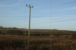
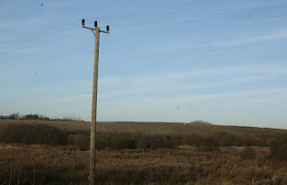
This photograph was also taken with a tripod and a high f stop of 22 to easily compose the image and bring out all the details of the photograph. I think that this was one of my worse images since the photograph could have easily included the rule of thirds. The simple change that I could have made was to change the angle of the photo to be taken so that the post would be further to the left side of the image as well as the wires above to run across the top of the image to show the rule of thirds. Cropping could be made to do this, however it would not compare to retaking the image in terms of an aesthetic appearance.
 |
| Before Edit |
 |
| After Edit |
This edit was made to bring out the rule of thirds of this image. I think the edit has achieved a greater appearance to the viewers eye since the lamp post and the green landscape are well positioned. This also brings out an easier focus point of the image being the post in comparison to the photo taken before. Overall I think this edit made a vast difference in terms of bringing about a better presentable look.
Work Diary Photo 3:
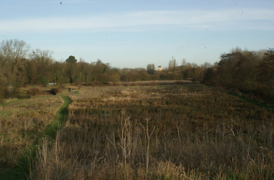
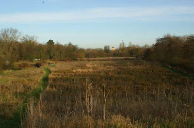
This photograph was taken on a hill to give an elevated point of view from the photograph. A tripod was used to compose the photograph and a high f stop of camera setting was used to bring out all aspects of the photograph. I think that this was a well composed photograph, however edits could be made to further improve the final image. These edits would be increasing saturation on the photograph to bring out all of the colours of the image.
 |
| Before Edit |
 |
| After Edit |
 |
| Edit Options |
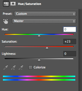
This increase in saturation brought about an enhancement of the colours from the photograph. I think that this was a successful edit since the foreground, midground and background are even easier to identify, making the photograph have a more aesthetic appearance to the viewer.
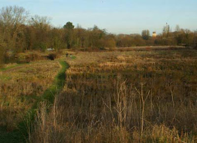
This photograph could be further edited to match the rule of thirds which would bring about a more aesthetic look to the photograph.
|
| Before Edit |
 |
| After Edit |
I think that cropping this photo does bring out the rule of thirds to bring about a more aesthetic look. It also emphasizes the foreground, midground and background of the photograph. However, it makes me feel as a viewer that there is much more to this photograph from the overcasting shadows and the lack of sky background. So this cropping could be viewed as more aesthetic however the viewer would feel the lack of information from this photograph.
Shoot Two Documentary
This second occasion of taking photographs was to discover the urban landscape of Harlow town as well as how nature and man made construction come together. The photos also show the decay of structures overtime, which results in a grimy appearance to the viewers.
Contact Sheet:
Straight Images:
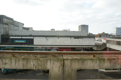
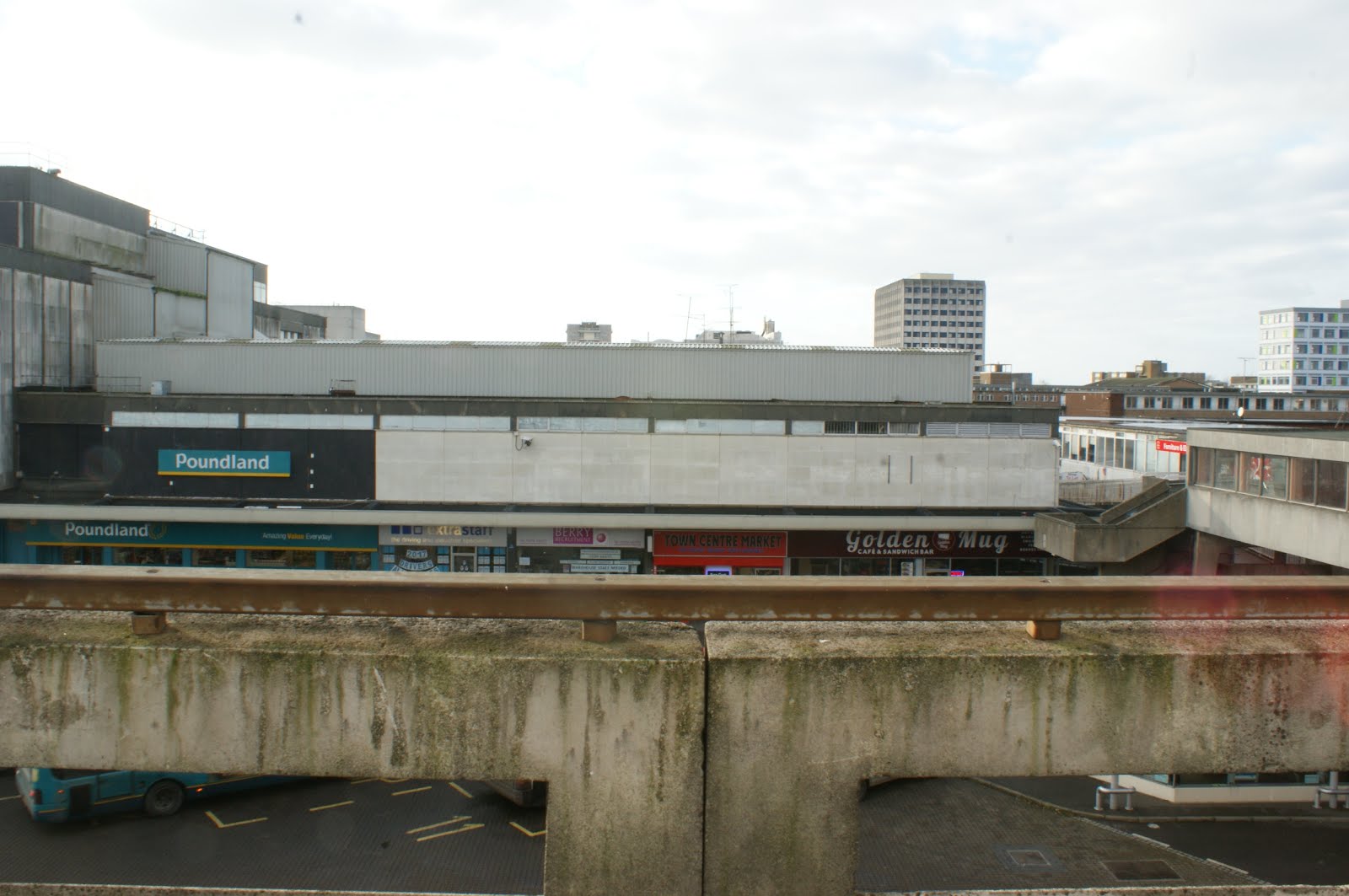
This is my favorite photograph because the foreground of the hand rails and stone structure really demonstrates the decay of man made structure overtime. This also shows a very large landscape of the surrounding buildings which also have that appearance of decay. The elevated spot was also inspired by Simon Roberts since his photographs were also taken at an elevated location which, in my opinion, brought about a very unique and aesthetic appearance to his photographs.
I like this photograph also since the landscape highlights the grime texture of the buildings afar. This landscape altogether appeals to me since the arrangement of buildings gives the photograph an aesthetic appearance. The only problem with this photo is the composition which can be fixed.
I think this photo is unique since it has natural wildlife as well as the landscape view of a man made town center. I also like the demonstration of foreground midground and background in this photograph which gives a very constructed image which results in an aesthetic appearance. There is also the same problem with this photograph that it could be cropped and rotated to fix the composition.
This photo brings out the grime appearance from the car park as well as the posts and stone railing which is complimented next to the clean buildings next to it which contradicts. This gives the photo an interesting appearance to the viewer since these two factors contradict. This photo may not give an aesthetic look but does demonstrate the decay of buildings overtime.
I like this photograph since the photograph demonstrates the empty car park as well as the further landscape of the town which. This photograph also has elevation to bring about a unique point of view when viewing this photograph and is also influenced by Simon Roberts photography.
Work Diary Photo 1:
This photo was taken with a high f stop of 22 and without using a tripod. I think that this picture is good however the composition is poor. So to make this photograph more appealing to the viewer, cropping and rotating is needed to have a more ordered look.
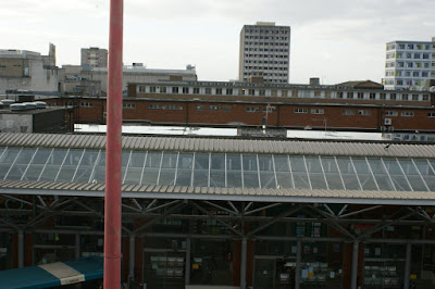 |
| Before Edit |
I used a ruler as a template to make sure that when rotating the image, it is straight rather than it being slightly diagonal.
This photo is after the rotation made which gives the photograph a more organised look. Cropping was needed to remove the right and bottom sides of the photograph since they were empty pixels.
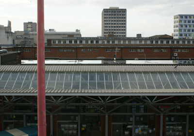 |
| Final Edit and Crop |
This is the final piece after editing. The final cropping gave the photograph a structured look by having a well composed image. I think that this was a successful edit since this image looks much more presentable in comparison to the first photograph taken.
Summary of Work
I think that this project was successful in terms of editing and photograph ideas with every location. However I think that my issue when taking photographs during this project was composing the camera to capture an impressive photograph with consistency. There is the odd photograph that was taken with a good composition, however I lack the consistency with taking well composed photographs as well as stop relying on editing to create a well composed image.
Final Series of Best Photographs