Monday, 12 December 2016

Simon Roberts Research Notes


Simon Roberts is a British photographer whose work includes our relationship to landscape notions of identity and belonging. His photographs are generally taken from elevated positions. These positions allow the relationship between the landscape and the people involved in the photo to be observed with ease. 

Simon travelled across England to construct a portfolio called "We English" which demonstrates the English leisure with the elements of warm colours and elevated landscapes. The resulting images demonstrate the beauty and relationship of people, place and connections to the landscapes around us.


This photograph from his portfolio, "We English", is a photograph of a beach in Cornwall from an elevated position. This landscape has a huge skybox with a crashing wave which creates the rule of thirds in this photograph. The wide depth of field also brings out an aesthetic look to the photograph because it brings out every detail  This photo connotes human sociability and wellbeing since the people involved in this photograph are positioned in a way that they are communicating with each other. This photo was from his portfolio which demonstrates the English leisure with the relationship of people taken in landscapes.


This photo is also from Simons portfolio "We English". It shows elements of nature as well as human structure which do not necessarily match together. It also shows elderly people walking in this environment. The rule of thirds are also seen in the composition of the photograph from the similar height of the power chimneys and the ground which covers the bottom third. This photo connotes how human industrialisation can destroy naturalistic landscapes. This photo was also taken from his portfolio which demonstrates the English leisure through landscape photographs.


This photograph by Simon shows many people gathered around Chatsworth House in Bakewell, Derbyshire. The rule of thirds can also be found in the composition of the photograph. This photograph connotes human sociability and unity since all of the people in the photograph are together in a friendly fashion. The colours also connote comfort and happiness because of their bright colours.

Overall this photographer had a great influence of my landscape photography, especially my project since his photographs are all taken on elevated positions and incorporate the rule of thirds. His photographs also influenced me to explore the urban environment which has been presented in my project. 

Documentary Photography Image Bank


These photographs, by British photographer Simon Roberts, all depict the English culture and natural beauty in the form of landscape photographs. For example, the top photograph presents an English family having a picnic on top of a building. The background has been included to also demonstrate the naturalistic beauty of Britain.

Documentary Photography Definition

Documentary photography usually refers to a popular form of photography used to chronicle events or environments both significant and relevant to history and historical events as well as everyday life.

Thursday, 8 December 2016

Landscapes Work Diary

Photo 1:


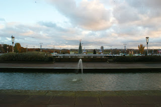
This landscape was photographed using a tripod to compose the image well. The camera settings used was a high f stop of 22 and a shutter speed of 1/125. When taking this photograph, I have attempted to keep things symmetrical such as the 2 lamp posts on the far right and left side of the photograph, and at the same time keep the fountain and the tree together at the middle of the image. In my opinion, this overall gives an aesthetic appearance when viewing this photograph. Minor tweaks could have been made to improve on this photograph such as making the lines from the poolsides 90 degrees from the right and left side of the image. This would have given an even better result of an image to appeal to the eye of the viewer.


After editing this image, very minor tweaks were made to adjust the image to make everything parallel as well as making the poolsides as a 90 degree angle from the left and right side of the photograph.


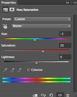
After even further editing, the saturation and hue of the image was adjusted to bring out the red colours of the image. Making this adjustment make the photograph even more aesthetic to view and generates a sense of satisfaction to the viewer as well as the editing process.

Photo 2:


This photograph was also taken with a tripod to give a good composition. The same camera settings were used when taking these photos with an f stop of 22 and a shutter speed of 1/125. This brought out a balanced tone to the image, highlighting all of the colours. The wide depth of field kept everything in focus, however the focus point of this landscape is clear to the journeying down this cycle track. The aim of the reflection of the water was to bring out the yellow colours of the sky which I feel like has been achieved. This yellow colour was also intended to become complimenting to the blue coloured cycle track which also gives an aesthetic appearance to the photograph.


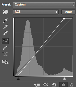
After editing I have used the curves tool to bring out the bright and darker tones even more into the photo. In my opinion, this has achieved a greater aesthetic appearance to the viewer.


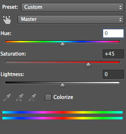
After even further editing the saturation was increased to amplify all of the images involved in this photograph. The yellow reflection and the blue cycle tracks complimenting colours are even more amplified to give an aesthetic appearance to the viewer of the photograph.

Landscapes Straight Images


This is my favourite photo taken of landscape since it does not follow the normal trend of landscape images. What inspired me to take this photo was Ruut Blees Luxembergs photograph, In Deeper from 1999. This inspired me to try recreate the photograph by taking a picture of a staircase with a wide depth of field. I believe that I have achieved this to some extent since it does follow a wide depth of field as well as capturing a close up photograph which demonstrates a landscape.


I like this photograph that I have taken of a landscape since there is a large reflection of the water from the sky which appeals to me as the viewer. The rule of thirds can also be recognised when looking at this image from the ending of the sand to the boardwalk out from the end of the beach.


This photograph interests me as a landscape since it easily directs my point of interest to ahead of the photograph where the cycle track leads. The small reflection of the puddle also interests me as the viewer because it also leads me to focusing into the cycle track.


This landscape interests me since it demonstrates how the urban world and nature harmonise together to create impressive places such as this. The fountain and the tree in the middle of the photo are aligned, giving an aesthetic appearance of this landscape. There is also much symmetry in this photograph like the two lamp posts on the right and left of the photograph which also gives an aesthetic appearance of this landscape.


I like this photograph since it represents the landscape of a town with the fountains because the fountains give an aesthetic appearance to the photograph. The flowing form of the water also interests me as the viewer because it demonstrates the various forms water can take place. This could also be judged as not a regular landscapes in comparison to other landscape photographs.

Thursday, 1 December 2016

Portraiture Image Bank


These images represent portraiture sing they all involve peoples facial features and represent their facial expression. All of these images also have their own unique flourish to depict the personality of the person being photographed. For example, the photograph of the man with the paintbrush depicts his personality to be creative.

Monday, 28 November 2016

Portraiture Definition

Portraiture is the photography or art of taking a picture of ones face where their facial expression is shown.

I have chosen this image to represent portraiture since the persons facial expression is shown and easily identifiable.

This portrait meets our expectations of a political or war hero since the masculine lighting of this portraiture demonstrates powerful body language and facial expressions. His clothing also indicates a formal position of work, in this case being a politician. 


This photograph taken by Amanda Lepore has feminine lighting which demonstrates the comfort of the person in the photograph. The personality indicated could be narcissistic or a sassiness from the overuse of makeup.


Shape Work Diary


This photograph was taken with a slower shutter speed with a higher aperture to bring out the light reflection and shape of the fountain. This is well composed since the path way behind the shape of the fountain the in a straight line.


This photo was taken with a very high aperture of f 22 which is why everything is in focus including the shape of the object and the background involved. I also think that this well well composed since the line of the beach in the background is a straight line. This photo has an easily recognisable focus point being the object in the middle.

This photo does include the shapes of the water flowing and the leafs from the water also. This was taken with a longer shutter speed to capture the dark scenery included in the photograph. I do not like this photograph since the settings were not very well accustomed to the dark background. This then caused the final capture of the photograph to come out grainy and out of focus. This would have been improved if the camera settings were adjusted to a more suitable setting which would then bring out a sharper image which would be more pleasant for the viewers eye. 

Framing Work Diary


.


This photo was taken by using a tripod placed onto the grass of a field. The aim of this photograph was to use the golden rule by offsetting the tree to the right. The camera settings were set to a high aperture with an f stop of 22. Before shooting this photo the camera was composed to match to the line of the top of the grass, focused onto the tree then took the photograph.


This photo was not taken with a tripod and also had the same camera settings as the photograph above. I do not like this photo since it does not match up to any sort of framing weather it is the rule of thirds or the golden rule. This photo would have been much better if it was taken with a camera position more to the right since it would have brought about the showing of the rule of thirds from the scaffolding of the building.


This photo was also taken without a tripod and with the same camera settings. This photo is well composed since the rule of thirds was used on the left side of the photograph. I also like the fact that the high aperture brings out the rest of the photograph of its surroundings.

Shape Straight Images


I like this picture representing shape since this machinery is in an unusual place to me being at the beach. I do also like the wide depth of field used since it demonstrates the shape of the object as well as its surroundings.

I also like this picture since it shows the shape water can take place and how it could change and flow as shown from the longer shutter speed used on the camera. This appeals to me since the fountains are also in an unusual spot making me want to know this destination.


This picture interests me since the macro shot really brings the water into viewpoint with its narrow depth of field. Also, this picture interests me since it is interesting to see what shape water can take in the conditions that it has.


This picture also interests me since it displays all sorts of shapes being reflected  onto the water. For example the wooden construction in the middle has a near to perfect reflection onto the water, making it interesting for me to view.


Finally this photo also interests me since the water has taken a very elegant shape from the fountain. The well composed shot of the photo easily influences the viewer to focus onto the fountain.

Sunday, 27 November 2016

Quiz

The main f stops are: 2, 2.8, 4, 5.6, 8, 11, 16, 22, 32, 64

The recommended f stops are f22 and up

Because it gives a wide depth of field

If the f stop was changed from 8 - 11 the light would be darker since the higher f stop, the less light that enters the camera by half.

The photographers that we were introduced to were Ansel Adams and Simon Roberts

Joiners Work Diary

The way that I have created these joiners was by choosing a location of an object or person and take several photographs of the object in sections. This was done such as the sculpture below.(not all images)


After the pictures were taken, They were resized to a width of 6 cm in width and 4 cm in height with a resolution of 300. After that they were all pasted onto a separate A4 image and rearranged to create the joiner. (below)