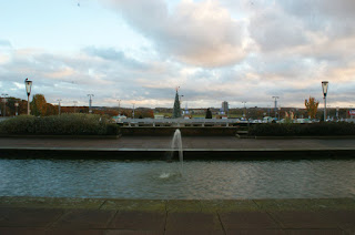
This landscape was photographed using a tripod to compose the image well. The camera settings used was a high f stop of 22 and a shutter speed of 1/125. When taking this photograph, I have attempted to keep things symmetrical such as the 2 lamp posts on the far right and left side of the photograph, and at the same time keep the fountain and the tree together at the middle of the image. In my opinion, this overall gives an aesthetic appearance when viewing this photograph. Minor tweaks could have been made to improve on this photograph such as making the lines from the poolsides 90 degrees from the right and left side of the image. This would have given an even better result of an image to appeal to the eye of the viewer.

After editing this image, very minor tweaks were made to adjust the image to make everything parallel as well as making the poolsides as a 90 degree angle from the left and right side of the photograph.


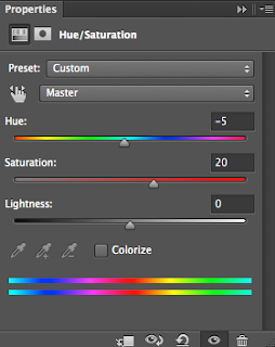
After even further editing, the saturation and hue of the image was adjusted to bring out the red colours of the image. Making this adjustment make the photograph even more aesthetic to view and generates a sense of satisfaction to the viewer as well as the editing process.
Photo 2:

This photograph was also taken with a tripod to give a good composition. The same camera settings were used when taking these photos with an f stop of 22 and a shutter speed of 1/125. This brought out a balanced tone to the image, highlighting all of the colours. The wide depth of field kept everything in focus, however the focus point of this landscape is clear to the journeying down this cycle track. The aim of the reflection of the water was to bring out the yellow colours of the sky which I feel like has been achieved. This yellow colour was also intended to become complimenting to the blue coloured cycle track which also gives an aesthetic appearance to the photograph.

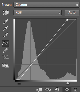
After editing I have used the curves tool to bring out the bright and darker tones even more into the photo. In my opinion, this has achieved a greater aesthetic appearance to the viewer.

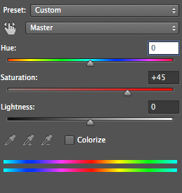
After even further editing the saturation was increased to amplify all of the images involved in this photograph. The yellow reflection and the blue cycle tracks complimenting colours are even more amplified to give an aesthetic appearance to the viewer of the photograph.


Very good habit please add the straight images and ancontact sheet for this assignment.
ReplyDelete