Monday 20 March 2017

Straight Composite Image


This is my final production of a composite image. This was inspired by Dan Holdsworth with his photographs of the northern lights including mountain peaks and cold coloured scenery. I think that this was replicated in a similar fashion with the nebula begin added to a photograph that I took. 

Thursday 2 March 2017

Storm Thorguson Research


Storm was a well known graphics artist that created images for well known artists and bands such as Pink Floyd. Thorgerson, who was of Norwegian descent, was born in Potters BarMiddlesex (now part of Hertfordshire), and he attended Summerhill School, Brunswick Primary School in Cambridge, and the Cambridgeshire High School for Boys with Pink Floyd founders Syd Barrett, who was in the year below him, and Roger Waters, who was in the year above him. Storm has a very unique style with creating graphic images. His work generally includes large unu
Audioslave
This photograph is an album cover for the band Audioslave. This graphic art displays a metallic flame in what appears to be in a mountain like landscape with someone spectating the flame. This matches to Storm's unique graphic work of using oversized objects and giving them glimmering metallic effects since the flame used achieves that.


Thursday 2 February 2017

Physical Images Straight Image


This is my physical image created by taking a photograph of the horses behind the fencing. This photographer that influenced me to create this image was John Baldessari, specifically his picture: "Tiger with three trainers". The picture by John highlighted the helplessness of the tiger being forced to jump through a flaming hoop. This helplessness is also emphasised in this photograph that I have created since the black and while, low saturated effect of the photograph brings out an unsettling feeling to the viewer. The fencing of the original photograph was stuck over with the paper which even further highlighted the helplessness of the horses. However the only difference between "Tiger with three trainers" and my photograph is that the tiger is coloured by stuck on paper while the horses in my image are not.

Monday 30 January 2017

Portraiture Work Diary


This photograph was taken with a lower figure aperture of f8 which brought about focus on the person as well as the wall behind. The camera settings were set to an aperture priority setting so the shutter speed was automatically adjusted to show a clear photograph. Minor changed could be made to make the bricks in an orderly fashion while keeping the person as the main focus of the photograph. This adjustment would be made by rotation and cropping.


Before Edit

After edit
I believe that this was a successful edit since the bricks in the background are aligned. However the lower section of bricks gradually become more disorganised in the photograph. The only solution to this would be retaking the photograph. Overall I think that the final photograph was a good result.


This photo was also taken with a relatively low f stop value with a value of f 8 which slightly blurs out the background. Cropping and colour adjustments could be made to create a more aesthetic photograph.

Before Edit

After Edit


I think that this edit was successful since the photo includes the rule of thirds with the persons eyes line and the windows being in the top third.

Monday 23 January 2017

John Baldessari Research Notes


John Beldessari is an American conceptual artist known for his work featuring found photography and appropriated images. He lives and works in Santa Monica and Venice, California.


John burned his own paintings, put coloured dots over faces in photographs, and covered floors at the LA County Museum such as this picture. The dots on top of the peoples faces are actually conjured price stickers that John has collected. The aim of the image was to hide the peoples face and have the viewer focused onto the peoples clothes, facial expressions and surroundings to paint a scenario without using facial emotions. This photograph in particular connotes love and interest in one another  since they're very close to each other while also having a relaxed body language at the same time.


This photograph was a manipulation of paper and colours to piece together this image of the womanly figure onto of the man. In my opinion, this artwork gives a mixed impression of love and invasion of person space. The connotation of love is presented through the hand holding of this photograph. However, the connotation of invasion of personal space is connoted by the purple colour of the woman's leg, onto of the red male figure which would demonstrate some kind of authority. The green, blue, purple and pink colours of the womanly figure also demonstrate more emotion and variety to a woman's personality while the male only has the colours red and orange which could depict aggression to a mans personality.


This photograph also uses the manipulation of coloured paper as well as the collected price stickers collected by John. This photo displays an orange coloured tiger jumping through a flaming hoop with three other people behind the cage with the price stickers over their faces. This connotes the helplessness of the tiger since it is behind the cage while the other people spectate the helpless animal. The motivation to make this picture was to highlight the wrong that people are doing to these animals. Therefore this was created and adapted to John's style of artwork.

Physical Images Image Bank


 Both of these photographs, created by Hannah Hoch, looks to have been created with physically manipulated items like paper which was probably traded and scratched. These photos were aleo transformed and altered to achieve its desired results such as the disproportionate body parts.


This artwork by John Baldessari manipulates images with filling subjects with colour to bring about different connotations and meanings to the photographs.

Physical Images Definition

Gilliam's animations link with Hanna Hoch's composites since both images and animation involve the manipulation of physical items to create something. For example, both Hanna and Gilliam's work both involve the use of newspaper that was cut to create their final pieces.

Hoch and Gilliam are a part of the Dada art movement. Dada or Dadaism was an art movement of the European avant-garde in the early 20th century, with early centers in Zürich, Switzerland at the Cabaret Voltaire and in New York.


Definition: Physically manipulated images.
Photo manipulation involves transforming or altering a photograph using various methods and techniques to achieve desired results.
Whilst this is usually done using software,  the physical adaptation of images is practised through e.g.
Tearing
Painting

scratching

Monday 16 January 2017

Composite Image Making Image Bank

I believe that composite images can be used to make something that is aesthetically pleasing such as the photograph below. This photo does not connote any unrealistic expectations from the general public nor does it convey any sort of false information to the people viewing. Therefore this photograph has the purpose of an aesthetic appearance without any false meaning.

However composite images can also be used to mislead. It can lead to humour or false information.

This photograph obviously is misleading. However it has been done with the intention of humour without having the general public believe a misleading source to a controversial topic.

However these photos are misleading on a controversial topic. OJ Simpson in the first magazine is in his normal colour. However the second magazine has manipulated the image to make OJ Simpson a person with a different race. This causes controversy since there is no real racial identity to him and the general public could be lead to believe that people with darker coloured skin are unacceptable and harmful people.

Composite Image Making Definition

composite Image is a picture that is made from the combination of multiple images merged into a single image. I think that this can have its benefits as well as its drawbacks such as making as aesthetic picture. However it could also make misleading images which could be published into the media. I think that composite images are right but only to a certain extent. They could be used to create aesthetically appealing images for the viewer. However it can also be used to create unrealistic/fake images such as magazine covers. This would then be viewed  by the general public who would be fed false information. 


This photo was created using photoshop to bring about a composite image of large rubber ducks in the river themes. The photo of the rubber duck was pasted as a separate layer than the background. This was then resized and placed into the appropriate position. Then a mask was created in every separate duck. The paintbrush tool was then used to 

Monday 9 January 2017

Aperture and Depth of Field

Depth of Field - The difference between the nearest and furthest objects giving a focused image.

Aperture - a space through which light passes in an optical or photographic instrument, especially the variable opening by which light enters a camera.

Aperture is important because it can affect the sharpness or blurriness of  a photograph. For example, if you are aiming to take a landscape photograph and want to bring about a sharpness of the photo, a high aperture is needed to achieve this.

Main Apertures: f 2.8, f 4, f 5.6, f 8, f 11, f 16, f 22, f 32, f 64

A shallow depth of field uses a low number f stop such as 2.8 to bring about a focused image while blurring out the background.

Aperture Comparison

These are photographs that I have taken to demonstrate how a change in aperture can affect the sharpness and blurriness of a photograph. 


The photograph on the left side brings out the post on the left side since there is an aperture of f5.6. However the photograph on the right has a high f stop of 22 which keeps most of the image in focus. This shows how an adjustment in aperture can change the appearance of a photograph in terms of sharpness and blur. 


This principle also applies to this photograph. There was also a low f stop f 5.6 used to bring out the bark on the left photograph while on the right photograph, every detail is sharp because of the high f top used of f 22. 

Henri Cartier Bresson Research Notes


Henri Cartier Bresson was a humanist photographer who captured his photographs in the 'decisive moment'. He pioneered in the genre of street photography and captured photographs to show the unnatural behaviour of those who were aware of being photographed. He explained "I suddenly understood that a photograph could fix eternity in an instant" when he started to take photography seriously.

The Decisive Moment

The decisive moment is the fraction of time that is captured by a camera that would show any action or gesture. The decisive moment is also a published book my Cartier Bressson which included a portfolio of 126 of his best photographs. 

Photo Analysis


Hyéres, France 1932

This is a black and white photograph taken of a street in the French town Hyéres in 1932. This was taken so that the black railing is composed horizontally and twisting into the centre area of the image. The photograph was taken on an elevated position being on top of the staircase


Photo Documentary Assignment

Topic

My chosen topic for this photo documentary is to record the way that the urban world harmonies with earths nature. This will be recorded by taking landscape photographs of both the urban environment as well as the naturalistic areas that can be found in Harlow town.

Shoot One Documentary
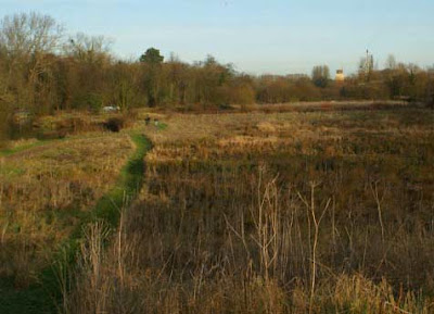
This first occasion of taking photographs was to discover the nature that can be found in Harlow town which relates to how the urban world harmonies with the earths nature. The location of these photos was the River Stort, towards the Harlow train station.
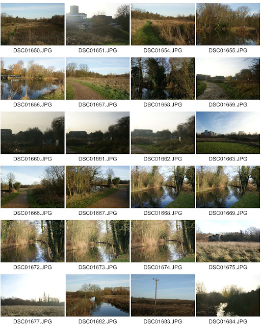
Contact Sheet:


Straight Images:

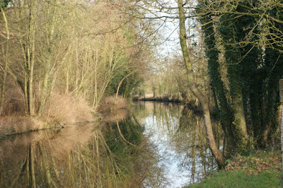
This is my favorite photograph when taking photographs on the first occasion. The reflection from the lake gives an aesthetic appearance to the viewer as well as the rule of thirds also used on the right and left side from the tree trunks reflecting off the water. The focus point of the photograph being the lakes reflection and beyond down the lake also gives an aesthetic appearance.

This photo is also similar to my first photograph since it shows the reflection of the trees and the elements of line and reflection are involved in the photo. This photograph was inspired by Simon Roberts style of photography in regards to landscape photographs being taken on elevated areas. This was taken on the bridge above the lake to give this elevation.
This photograph demonstrates the harmonization of the urban world and the naturalistic environment. This in particular shows the overgrowth of greenery on the walkway, showing how plants can take over such man built objects. The shape of the walkway also interests me since its an unusual shape in my opinion. This photograph was also inspired by Simon Roberts since some of his photographs include man made buildings as naturalistic landscapes.
I like this photograph since it demonstrates the way that human made pathways have such a relation with nature such as the complementary colours between the grass and gavel pathway. The pathway also gives the photo a good focus point to have the focus travel down the pathway then the surrounding trees around the photograph. This focus was achieved with the lines of the gravel used in the photograph.
This is my final photo for my straight images. This photo was again influenced by Simon Roberts since it both shows little man made buildings as well as the photograph being taken on an elevation.
I like this photo since the overcasting shadows really bring out various tones to the photo, almost fading the left side from darkness into the lighter left side of the photograph. The foreground, midground and background also give the photograph a lifelike feeling of what it would have been like at this destination at that time.

Work Diary Photo 1:


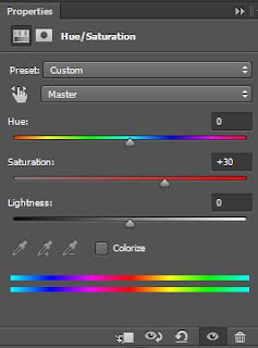
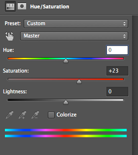
This photograph was taken using a tripod to compose the photo and make sure that there was no motion blur while the photograph was taken. The aperture used was an F stop of 22 to bring out every detail in this landscape including the reflection from the lake. I think that this photograph does not need to be rotated or cropped in any way since it demonstrates the rule of thirds easily and shows the reflection very clearly. Editing could be to enhance the colours by increasing the saturation of the photograph.
 
Before Edit

After Edit

Edit Options

After increasing the saturation, the yellow and green colours have been really brought out. This gave the photograph almost an aesthetic look when viewing. This edit also brings out a more noticeable distinction between colours, having the viewer very interested in the image, however not too bombarded with too many colours at the same time. The amount of saturation used does bring out the colours, however it does not make the photo over processed. Overall I think the choice of bringing out the colours of this image really improved on the final product when editing.
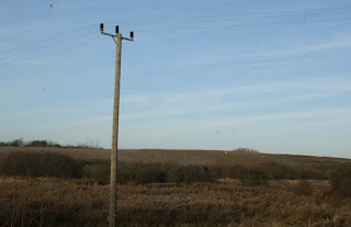
Work Diary Photo 2:


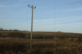
This photograph was also taken with a tripod and a high f stop of 22 to easily compose the image and bring out all the details of the photograph. I think that this was one of my worse images since the photograph could have easily included the rule of thirds. The simple change that I could have made was to change the angle of the photo to be taken so that the post would be further to the left side of the image as well as the wires above to run across the top of the image to show the rule of thirds. Cropping could be made to do this, however it would not compare to retaking the image in terms of an aesthetic appearance.

Before Edit
After Edit
This edit was made to bring out the rule of thirds of this image. I think the edit has achieved a greater appearance to the viewers eye since the lamp post and the green landscape are well positioned. This also brings out an easier focus point of the image being the post in comparison to the photo taken before. Overall I think this edit made a vast difference in terms of bringing about a better presentable look.
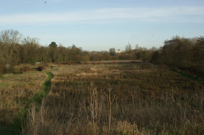
Work Diary Photo 3:


This photograph was taken on a hill to give an elevated point of view from the photograph. A tripod was used to compose the photograph and a high f stop of camera setting was used to bring out all aspects of the photograph. I think that this was a well composed photograph, however edits could be made to further improve the final image. These edits would be increasing saturation on the photograph to bring out all of the colours of the image.

Before Edit


After Edit
Edit Options

This increase in saturation brought about an enhancement of the colours from the photograph. I think that this was a successful edit since the foreground, midground and background are even easier to identify, making the photograph have a more aesthetic appearance to the viewer.
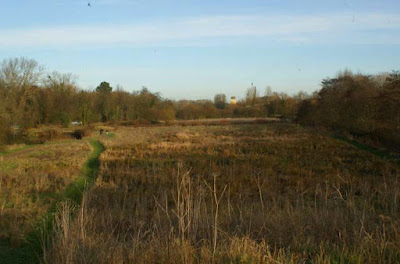
This photograph could be further edited to match the rule of thirds which would bring about a more aesthetic look to the photograph.

Before Edit
After Edit
I think that cropping this photo does bring out the rule of thirds to bring about a more aesthetic look. It also emphasizes the foreground, midground and background of the photograph. However, it makes me feel as a viewer that there is much more to this photograph from the overcasting shadows and the lack of sky background. So this cropping could be viewed as more aesthetic however the viewer would feel the lack of information from this photograph.

Shoot Two Documentary

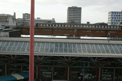
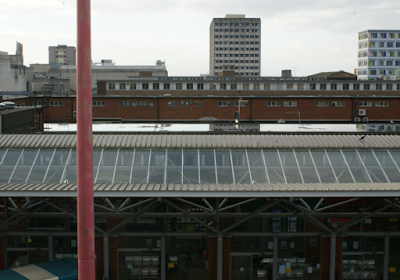
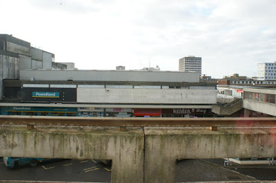
This second occasion of taking photographs was to discover the urban landscape of Harlow town as well as how nature and man made construction come together. The photos also show the decay of structures overtime, which results in a grimy appearance to the viewers.

Contact Sheet:


Straight Images:
This is my favorite photograph because the foreground of the hand rails and stone structure really demonstrates the decay of man made structure overtime. This also shows a very large landscape of the surrounding buildings which also have that appearance of decay. The elevated spot was also inspired by Simon Roberts since his photographs were also taken at an elevated location which, in my opinion, brought about a very unique and aesthetic appearance to his photographs.
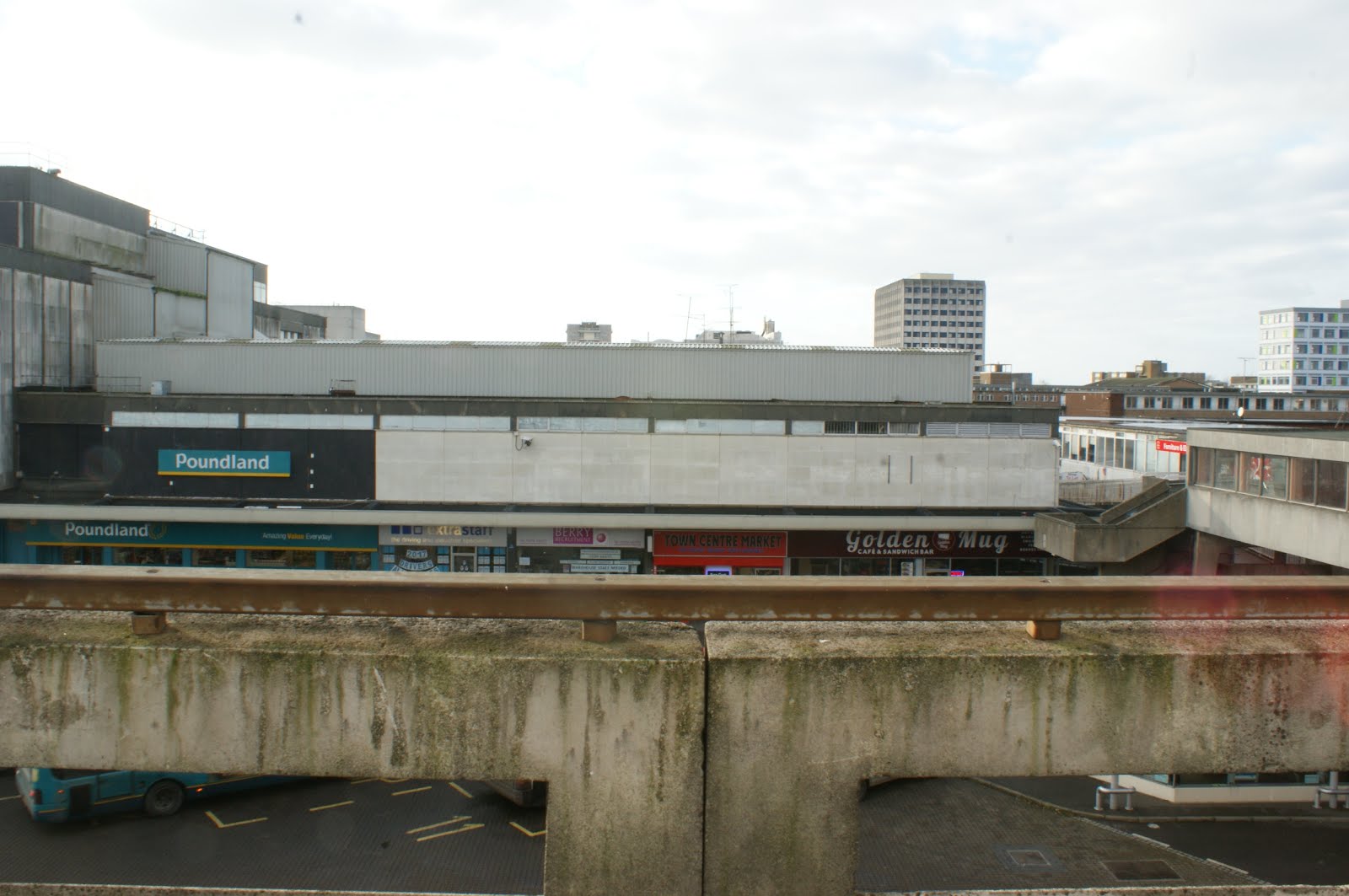
I like this photograph also since the landscape highlights the grime texture of the buildings afar. This landscape altogether appeals to me since the arrangement of buildings gives the photograph an aesthetic appearance. The only problem with this photo is the composition which can be fixed.
I think this photo is unique since it has natural wildlife as well as the landscape view of a man made town center. I also like the demonstration of foreground midground and background in this photograph which gives a very constructed image which results in an aesthetic appearance. There is also the same problem with this photograph that it could be cropped and rotated to fix the composition.
This photo brings out the grime appearance from the car park as well as the posts and stone railing which is complimented next to the clean buildings next to it which contradicts. This gives the photo an interesting appearance to the viewer since these two factors contradict. This photo may not give an aesthetic look but does demonstrate the decay of buildings overtime.
I like this photograph since the photograph demonstrates the empty car park as well as the further landscape of the town which. This photograph also has elevation  to bring about a unique point of view when viewing this photograph and is also influenced by Simon Roberts photography.

Work Diary Photo 1:


This photo was taken with a high f stop of 22 and without using a tripod. I think that this picture is good however the composition is poor. So to make this photograph more appealing to the viewer, cropping and rotating is needed to have a more ordered look.

Before Edit
I used a ruler as a template to make sure that when rotating the image, it is straight rather than it being slightly diagonal.

This photo is after the rotation made which gives the photograph a more organised look. Cropping was needed to remove the right and bottom sides of the photograph since they were empty pixels.
Final Edit and Crop

This is the final piece after editing. The final cropping gave the photograph a structured look by having a well composed image. I think that this was a successful edit since this image looks much more presentable in comparison to the first photograph taken.

Summary of Work

I think that this project was successful in terms of editing and photograph ideas with every location. However I think that my issue when taking photographs during this project was composing the camera to capture an impressive photograph with consistency. There is the odd photograph that was taken with a good composition, however I lack the consistency with taking well composed photographs as well as stop relying on editing to create a well composed image.

Final Series of Best Photographs